Why AI Websites Look the Same (And When It Matters)

Author
Why AI Websites Look the Same (And When It Matters)

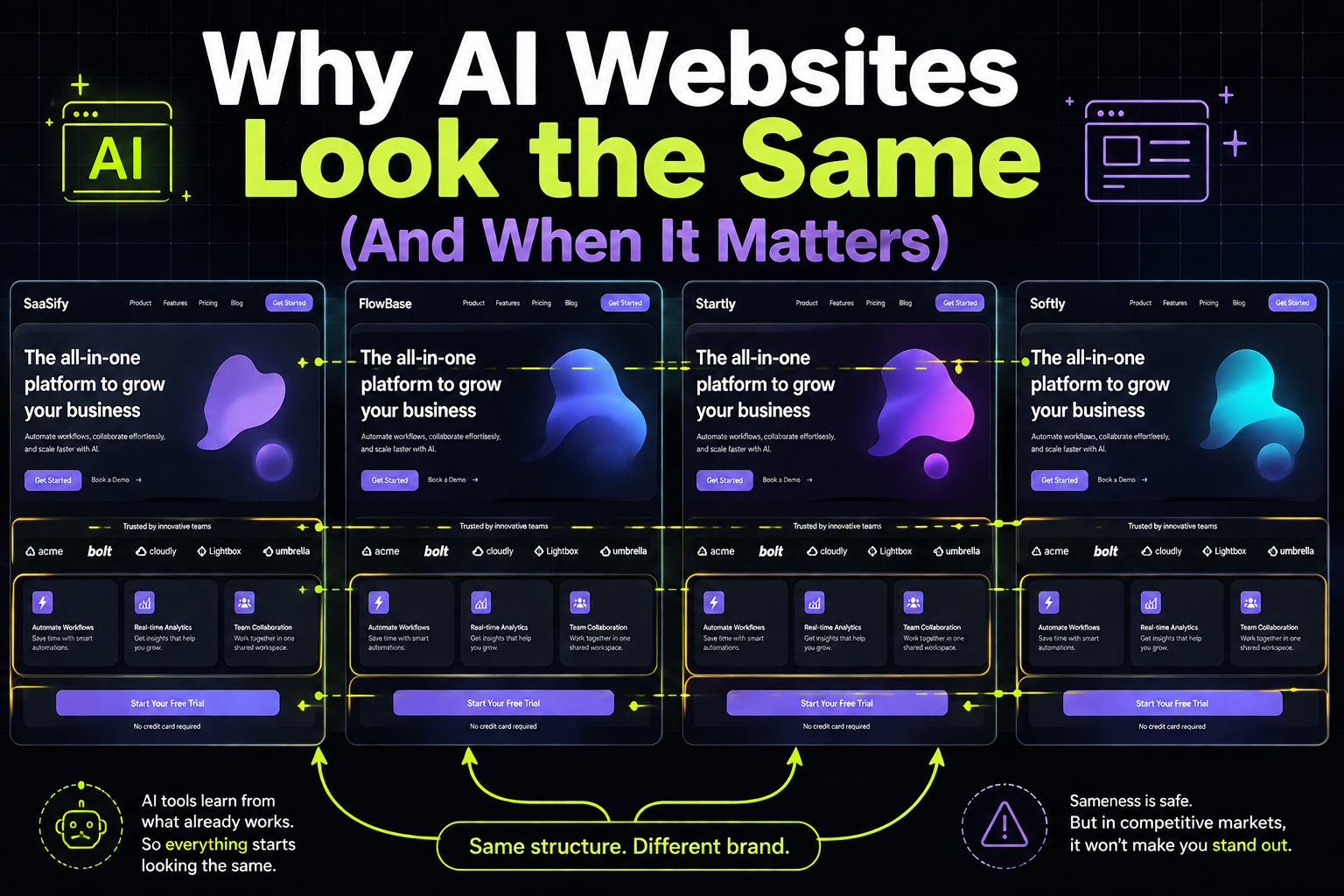
Try this out. Open several SaaS websites in separate tabs. Look at their design. They can belong to different categories, built by different teams, and have different use cases. But oddly, they’ll all feel almost identical.

The same hero structure across each page, a gradient visual sits in the corner. A neutral sans-serif headline promises transformation. Logo badges, a three-column feature grid explains the product, and a teal or blue call-to-action button closes the section.

That’s not an accident, but a pattern of how modern AI design tools operate.

What Changed

AI website builders have become fast and accessible. Founders who previously lacked design resources can now launch a credible-looking site in under an hour. This shift removed a meaningful barrier to entry and accelerated product launches.

However, these tools are trained on similar datasets. They learn from high-performing SaaS websites, established templates, and layouts that signal credibility. The result is predictable. When thousands of companies rely on the same systems, they produce variations of the same structure.

This is not a limitation of effort, but input.

Why Sameness Becomes a Problem

When a website resembles multiple others in the same category, users disengage. They do not consciously identify the similarity and reject it. Instead, they skim. Attention weakens. The site is processed quickly and placed into a mental category of acceptable but unremarkable options.

This creates a silent failure. The design does not repel users, but it does not persuade them either. In competitive markets, that distinction matters.

How Buyers Actually Experience It

Enterprise buyers and investors evaluate many products over time. They develop pattern recognition that operates below conscious awareness. When a website aligns too closely with familiar templates, it triggers a specific interpretation.

The company appears generic.

This perception does not imply low quality. It suggests a lack of deliberate positioning. In B2B contexts, that assumption carries consequences:

  • Fewer internal shares of your product link
  • Lower likelihood of follow-up discussions
  • Reduced confidence during budget justification
  • Weak internal advocacy from decision-makers

These outcomes are rarely traced back to design directly. However, they are influenced by it.

When Sameness Is Acceptable

Not every company needs immediate differentiation.

There are scenarios where a standard structure is sufficient:

  • Early-stage products that need a quick online presence before demos
  • Companies relying primarily on outbound sales where the site acts as validation
  • Categories with minimal competition or visual noise

In these situations, speed and clarity take priority over distinction.

The problem emerges when the stakes change. Paid acquisition, enterprise sales cycles, and crowded markets demand stronger positioning. At that stage, blending in is not neutral. It reduces effectiveness.

What Real Differentiation Looks Like

Differentiation is not about visual novelty. Unconventional layouts that confuse users don’t improve outcomes. Effective differentiation operates across three specific dimensions.

A clear point of view in the copy

The messaging should define who the product serves and what it believes about the problem. Vague statements about productivity or efficiency do not create separation. A precise claim encourages the right customers to engage and the wrong ones to disengage.

A deliberate visual hierarchy

The most important idea on the page should be immediately visible. This could be a proof point, a core claim, or a defining insight. Navigation elements and decorative visuals should not compete for attention with that message.

Relevant and specific trust signals

Generic endorsements have limited impact. Enterprise buyers respond to concrete evidence such as named clients, measurable outcomes, and recognizable use cases. These signals reduce perceived risk.

How to Evaluate Your Website

A simple audit can reveal whether your site is working effectively.

Open your homepage alongside two or three competitors. Remove brand identifiers mentally and compare the structures. If the pages appear interchangeable, differentiation is insufficient.

Then consider the first impression your site creates. What should a buyer believe after viewing the initial screen? The design and content should actively build that belief. If the page feels like it is filling space rather than making an argument, it is underperforming.

These questions provide more insight than most analytics tools.

The Gap AI Tools Cannot Close

AI design tools excel at producing credibility at speed. That was once the primary challenge in website creation. It is no longer the limiting factor.

The current challenge is specificity. A strong website must communicate a clear perspective, address the concerns of a defined buyer, and create a distinct impression. This requires deliberate choices about positioning, messaging, and prioritization.

These decisions cannot be automated effectively because they depend on context. They require an understanding of customer psychology, market dynamics, and sales processes.

In Summary

If your website is live but you are uncertain whether it is performing the strategic role it should, that gap is worth addressing before your next campaign or sales push. Payan Design works with B2B SaaS companies to refine positioning, strengthen messaging, and build websites that convert with intent.

Simple, ongoing design
support for fast-moving
teams.

Ongoing design requests, handled with predictable turnaround. No long-term commitment.

Interactive Design Preview