UI vs UX Design in SaaS: The Strategic Difference That Impacts Conversion

Author
UI vs UX Design in SaaS: The Strategic Difference That Impacts Conversion

UI design influences credibility and first impressions on a SaaS website. UX design controls structure, messaging flow, and decision clarity. While UI improves visual authority, UX determines whether buyers move from curiosity to demo request. Understanding the difference helps SaaS teams diagnose conversion issues accurately.

Introduction

A few months ago, I reviewed a SaaS website that had just gone through a “modern redesign.” The colors were sharper. The typography felt cleaner. The animations were smoother. On the surface, it looked like progress.

But demo requests hadn’t moved.

When I asked the founder what changed structurally—how the messaging flowed, how objections were handled, how pricing logic was clarified—there was silence. The redesign had focused almost entirely on interface polish. The evaluation journey stayed exactly the same.

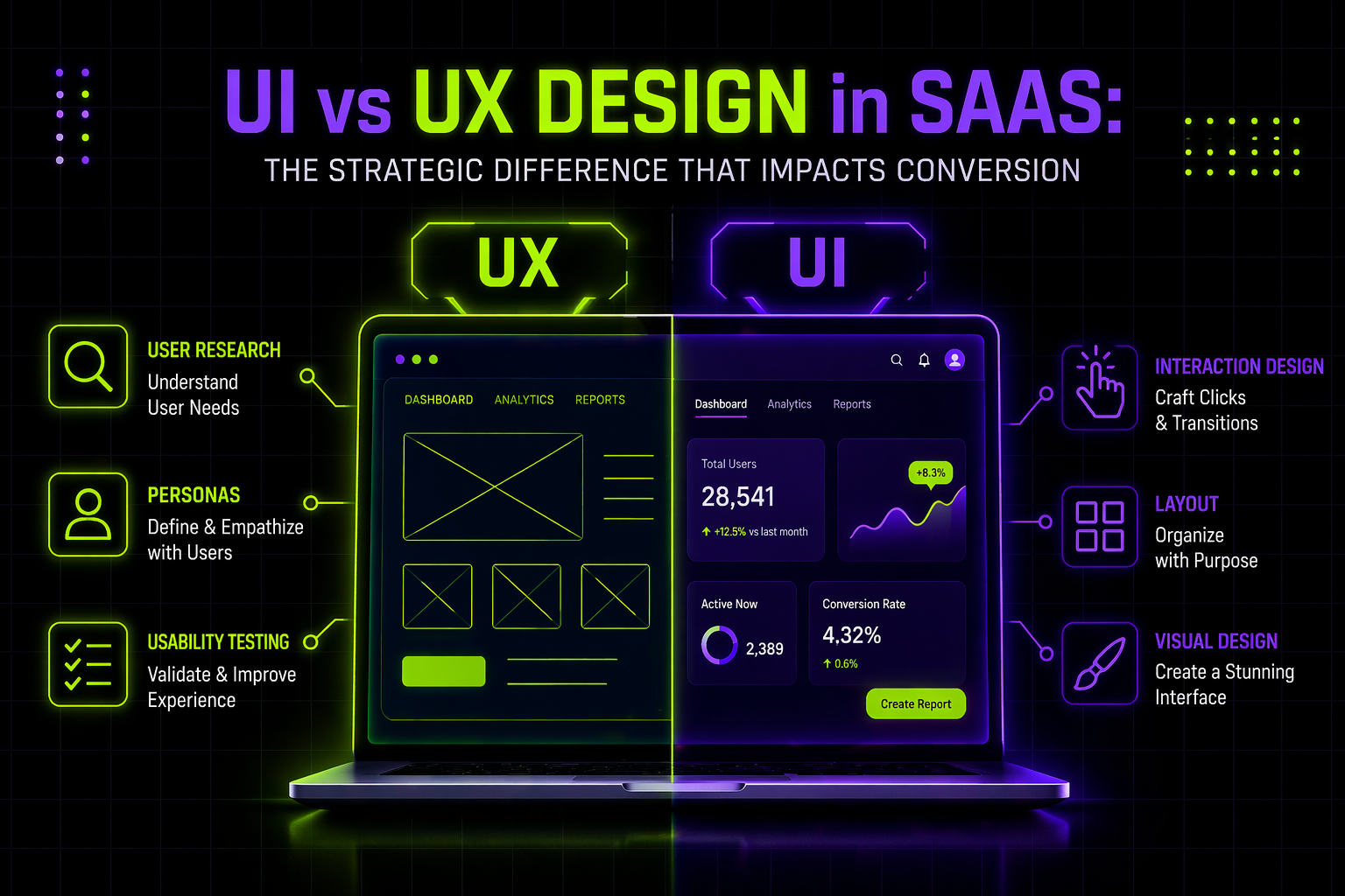
This is where most SaaS teams misunderstand UI vs UX design. They assume better visuals will automatically improve conversion. Sometimes they do. But often, the real issue is deeper: unclear positioning, scattered proof, weak flow between sections, or friction at the decision stage.

For SaaS companies—especially B2B—the website is not just a branding asset. It’s a qualification engine. And when conversion stalls, you need clarity on whether you’re solving a surface problem (UI) or a structural one (UX).

In this guide, I’ll break down the difference in a way that directly connects to website performance and demo conversion. You’ll leave with actionable insights to diagnose what’s actually blocking growth—and how to fix it strategically.

Table of contents

  • Why UI vs UX matters for SaaS website conversion
  • What UI design really influences on a SaaS website
  • What UX design controls in the evaluation journey
  • How modern B2B buying behavior changes the stakes
  • A practical diagnostic: UI issue or UX issue?
  • Best practices to align UI and UX for demo growth
  • How to approach redesign without wasting budget

Why UI vs UX matters for SaaS website conversion

SaaS buying is mostly digital now

Gartner reports that 75% of B2B buyers prefer a rep-free sales experience during parts of their journey. That means your website carries far more responsibility than it did five years ago. It must educate, differentiate, and build trust before a conversation even begins.

When your site underperforms, the instinct is often “design problem.” But design has layers.

UI affects perception.

UX affects decision-making.

If you fix the wrong layer, you burn the budget without moving the pipeline.

What UI design really influences on a SaaS website

UI is the credibility layer

UI design on a SaaS website includes:

  • Visual hierarchy
  • Typography clarity
  • Spacing consistency
  • Button and CTA styling
  • Overall visual maturity

It answers a simple but powerful question:

“Does this company look trustworthy and established?”

Research from Nielsen Norman Group continues to show that visual clarity and consistency directly influence perceived usability and trust. When layouts are cluttered or inconsistent, users assume complexity—even if the product itself is strong.


Where UI improves conversion

UI makes the biggest difference when:

  • Visitors leave within seconds because the site feels outdated
  • Pages are difficult to scan
  • CTAs don’t stand out clearly
  • Content feels visually overwhelming

In these cases, improving hierarchy and clarity can immediately reduce bounce rates and increase engagement.

But UI alone rarely fixes structural confusion.

What UX design controls in the evaluation journey

UX is the structural layer of conversion

UX on a SaaS website is about:

  • Information architecture
  • Messaging flow
  • Objection handling
  • Page sequencing
  • Conversion friction

It answers a different question:

“Can a buyer move from curiosity to confidence without getting stuck?”

Forrester’s Customer Experience research shows how even strong brands can lose ground when experiences lack clarity and cohesion—19% of brands saw CX quality decline in 2022, largely due to fragmented journeys.


On a SaaS website, fragmentation shows up as:

  • Feature pages without outcome framing
  • Pricing pages without decision guidance
  • Case studies placed randomly instead of at risk points
  • Demo forms that feel abrupt and high-friction

These are UX problems, not UI problems.

How modern B2B buying behavior changes the stakes

Today’s SaaS buyer does independent research before speaking to sales. They compare competitors, estimate implementation effort, and assess risk.

When your website doesn’t clearly guide that evaluation, conversion stalls—not because it looks bad, but because it doesn’t reduce uncertainty.

Performance also plays a role here. Google’s Core Web Vitals case studies demonstrate measurable business impact from experience improvements. Vodafone Italy improved Largest Contentful Paint by 31% and saw an 8% increase in sales.


Speed and clarity are part of UX. If pages load slowly or key information is buried, hesitation increases.

A practical diagnostic: UI issue or UX issue?

You likely have a UI issue if:

  • The brand looks less mature than competitors
  • Layout feels cluttered or inconsistent
  • Visitors don’t scroll because the first screen lacks clarity

You likely have a UX issue if:

  • Visitors scroll deeply but don’t convert
  • Sales calls repeat the same basic explanations
  • Pricing gets traffic but no action
  • Case studies exist but don’t resolve key objections

You likely have both if:

  • You recently “redesigned” but metrics barely moved
  • The site looks modern but still feels confusing
  • Traffic increases but demo requests stay flat

The distinction matters because UI fixes polish. UX fixes logic.

Best practices to align UI and UX for demo growth

Start with conversion intent, not visuals

Before redesigning anything, define:

  • What is the primary conversion action?
  • Where does hesitation occur?
  • What objections block commitment?

Build a structured evaluation flow

High-performing SaaS websites move users through a logical sequence:

  • Problem clarity
  • Differentiation
  • Proof and validation
  • Pricing logic
  • Clear next step

Maintain visual consistency to reinforce trust

Use:

  • A consistent CTA style
  • Clear spacing systems
  • Repeatable proof modules
  • Strong typographic hierarchy

When UI reinforces UX, conversion friction drops significantly.

How to approach redesign without wasting budget

Many SaaS teams initiate a “website redesign” without diagnosing whether they need:

  • Interface refinement
  • Structural re-architecture
  • Messaging repositioning
  • Or full evaluation journey restructuring

At Payan, we approach this differently. We don’t start with visuals. We start with clarity.

We analyze where buyers hesitate, where messaging fragments, and where structure breaks. Only then do we determine whether the solution is UI refinement, UX restructuring, or both. That prevents overbuilding and ensures design decisions connect directly to pipeline impact.

Conclusion

If you remember one thing from this article, let it be this: UI and UX are not interchangeable—and choosing the wrong focus costs conversion.

UI improves credibility, clarity, and first impressions.

UX determines whether a SaaS buyer builds enough confidence to request a demo.

In a market where most B2B buyers prefer digital-first evaluation, your website must function as a structured decision engine—not just a polished interface. When metrics stall, the real question isn’t “Do we need better design?” It’s:

  • Are we lacking visual authority?
  • Are we lacking structural clarity?
  • Are buyers confused, or just unconvinced?

The answer determines your next move.

At Payan, this distinction is central to how we approach SaaS website strategy. Before recommending a redesign, we diagnose whether the bottleneck is interface polish or evaluation structure. That clarity prevents unnecessary rebuilds and focuses effort where it actually moves demos.

This perspective comes directly from Yuvi’s work with SaaS teams navigating stalled growth and misaligned redesign efforts. If you’d like a focused review of your website to identify whether you need UI refinement, UX restructuring, or both, you can reach out to Yuvi for a strategic evaluation conversation.

Sometimes a single diagnostic conversation changes the direction of your next quarter.

Simple, ongoing design
support for fast-moving
teams.

Ongoing design requests, handled with predictable turnaround. No long-term commitment.

How This AI Brand Got the Upgrade It Deserved →
Interactive Design Preview