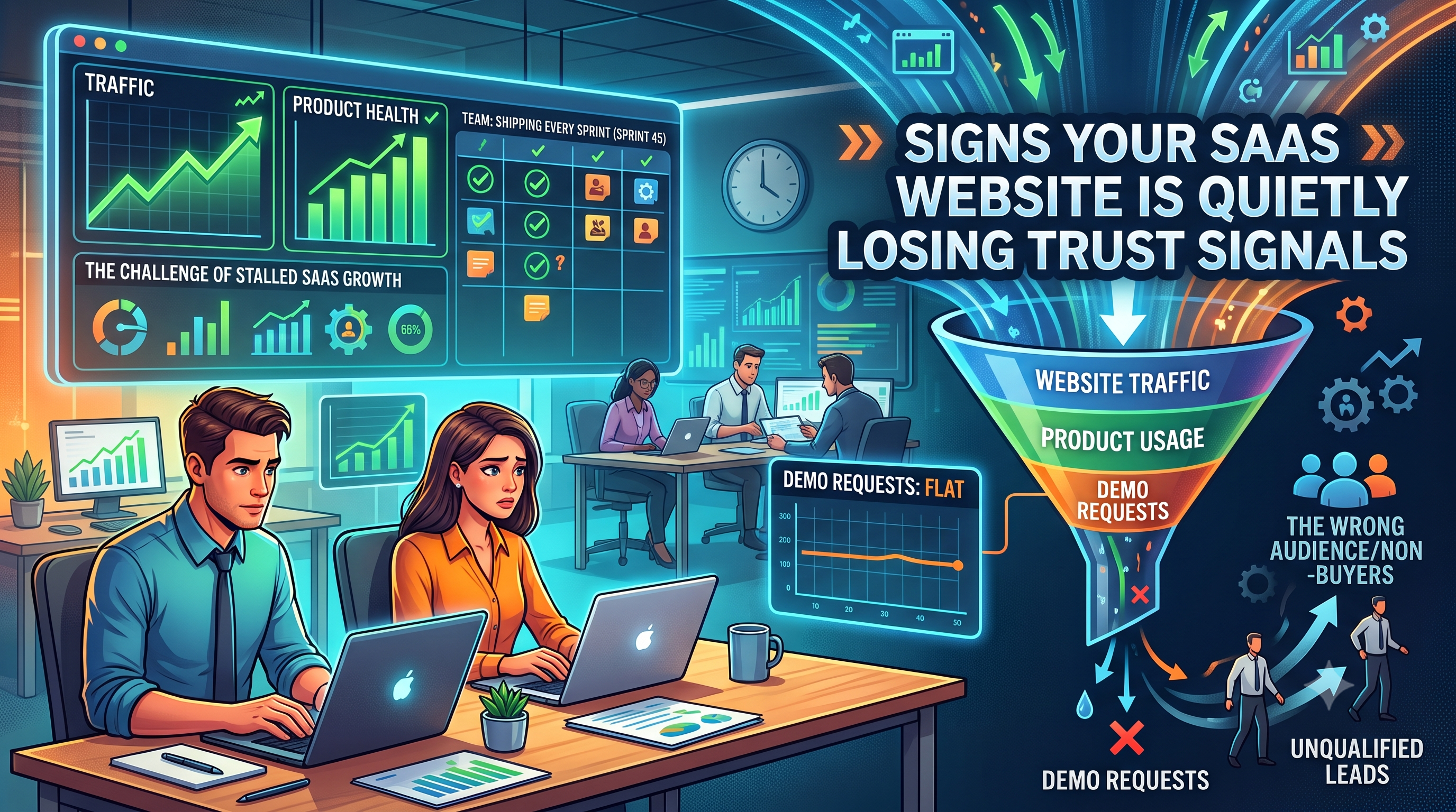
Your traffic looks fine. Your product is solid. Your team ships updates every sprint. And yet demo requests have gone flat, or worse, they're trickling in from people who were never going to buy.
Most marketing teams respond to this by checking the obvious things first. Page speed. SEO rankings. Ad spend. Copy. All reasonable places to look. But there's a quieter problem that rarely shows up in any of those audits, because it isn't a performance issue or a messaging issue. It's a trust issue. And trust doesn't fail loudly. It erodes in small, cumulative ways until a visitor closes the tab without knowing exactly why.
Here's the friction. Trust signals aren't a single feature you can point to and fix. They're spread across dozens of tiny decisions on a site, most of them invisible to the people who built it. A founder who has looked at their homepage five hundred times stops noticing the stock-photo team page, the testimonial with no name attached, the pricing page that dodges the actual number. But a new visitor sees all of it in the first eight seconds, and they're making a judgment before they've read a single sentence of your copy.
This is where most teams get the diagnosis wrong. They assume a drop in conversion means the messaging is off, so they rewrite headlines. They assume it means the design is dated, so they refresh colors and fonts. Sometimes that's true. But often the site reads clearly and looks modern, and visitors are still leaving unconvinced. That's the signature of a trust problem, not a clarity problem. The visitor understood what you do. They just didn't believe you could be trusted to do it for them.
A few patterns show up again and again on SaaS sites that are bleeding trust without anyone noticing. Testimonials with a first name and no company, no title, no photo. Case studies that talk about outcomes in vague percentages with nothing anchoring them to a real business. Security or compliance badges that are outdated or missing entirely, even though the company is actually SOC 2 certified. A "Contact Us" page that gives no sense of who's on the other end. Product screenshots that are clearly staged rather than pulled from a real account. None of these individually will tank a conversion rate. Together, they build a low hum of doubt that a visitor can't quite name but reacts to anyway.
The deeper issue is that trust signals are a buyer psychology problem before they're a design problem. A B2B buyer evaluating software isn't just asking "does this solve my problem." They're asking "if this goes wrong, who's accountable, and have other people like me already taken this risk and been fine." Every trust signal on your site is either answering that question or leaving it open. Specificity answers it. Vagueness leaves it open. A testimonial that says "This tool changed our workflow" answers nothing. A testimonial that says "We cut onboarding time from three weeks to four days, and our CS team stopped fielding the same five tickets every week" answers it directly, because it sounds like something a real person said about a real result.
The fix isn't a redesign. It's an audit, and it's more forensic than creative. Walk your site the way a skeptical buyer would, not the way you know it. Look at every testimonial and ask if it would survive someone Googling the name. Look at every case study and ask if the numbers are specific enough to be believable. Look at your team page and ask if it looks like a company that's still operating, not one that quietly folded eighteen months ago. Look at your pricing page and ask if hiding the number is protecting your sales process or just adding one more reason to leave.
This is slower and less glamorous than a visual refresh, but it's usually where the actual conversion lift comes from. Buyers don't need a beautiful site. They need a site that gives them enough reasons to believe you, fast enough that they don't have time to talk themselves out of it.
If this sounds like your site right now, it's worth having someone outside your team look at it with fresh eyes. That's usually the fastest way to spot what's become invisible to you. Payan works with SaaS teams as a design partner, running exactly this kind of trust and conversion audit before recommending any changes, so the fixes are targeted instead of cosmetic.