SaaS Website Strategy: Structuring Your Site to Increase Demos & Signups

Author
SaaS Website Strategy: Structuring Your Site to Increase Demos & Signups

Modern SaaS buyers evaluate before they convert. This guide explains how to structure your website as a qualification engine—aligning information architecture, trust distribution, pricing clarity, and UX friction removal to increase demos and signups.

Introduction

In SaaS, your website is no longer a marketing asset. It is a qualification engine.

By the time a serious buyer speaks to your sales team, they have already:

  • Compared alternatives
  • Estimated pricing range
  • Evaluated implementation effort
  • Reviewed customer proof
  • Checked integration feasibility
  • Formed a confidence level

If your website doesn’t structure that evaluation journey clearly, traffic growth will not translate into demos or signups. You don’t have a traffic problem. You have a structural problem.

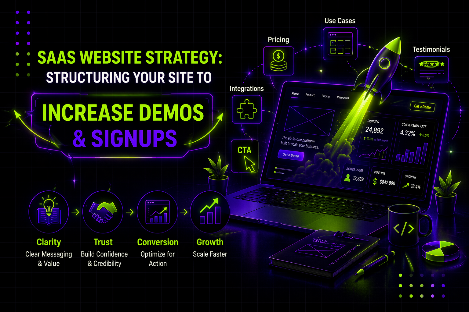
A strong SaaS website strategy is not about design trends or visual polish. It is about aligning information architecture, messaging hierarchy, and conversion pathways with how modern SaaS buyers think and decide.

This guide breaks down how to build that structure properly.

The Strategic Shift: From Pages to Evaluation Systems

Most SaaS websites are built page-by-page. A homepage is designed. A features page is added. A pricing page is drafted. Over time, the site grows organically.

High-performing SaaS websites are built system-by-system.

That distinction matters.

A page-based mindset focuses on content blocks. A system-based mindset focuses on buyer psychology.

Modern SaaS buyers move through four mental stages:

  1. Confirm the problem
  2. Map the solution to their context
  3. Evaluate risk and feasibility
  4. Shortlist vendors

Your website must mirror this progression structurally. If information is scattered, hidden, or poorly sequenced, friction increases. When friction increases, hesitation grows. When hesitation grows, demos drop.

Website strategy begins by mapping your structure to those four stages.

Clarity Before Persuasion

The first ten seconds on your website determine whether the visitor continues evaluating or leaves.

Clarity at this stage is not about creativity. It is about cognitive load.

Your hero section must immediately communicate:

  • What your product does
  • Who it is for
  • What measurable outcome it creates
  • What the next action should be

Ambiguity kills demo rates faster than weak visuals.

Many SaaS teams invest heavily in visual differentiation while underinvesting in message clarity. But buyers do not reward originality. They reward clarity.

Design here plays a structural role: headline hierarchy, spacing, contrast, and CTA dominance must guide the eye deliberately. The goal is not aesthetic expression. It is comprehension speed.

Structuring for Segmentation

Most SaaS products serve multiple roles or use cases. The mistake is presenting all of them equally without guiding the visitor.

When buyers land on your homepage, they subconsciously ask:

“Is this built for someone like me?”

Your website must answer that quickly through structured segmentation. This can take the form of persona-based pathways, use-case categories, or industry groupings. The key is reducing search effort.

From a design perspective, this means creating clear visual paths rather than long descriptive paragraphs. It also means prioritizing layout hierarchy so that segmentation blocks are prominent, not buried.

When segmentation is clear, engagement increases because buyers feel understood.

Designing for Trust Distribution

Trust is not built on a single testimonial page. It is built through strategic distribution.

High-performing SaaS websites do not isolate proof. They embed proof exactly where doubt peaks.

When you make a claim about performance, you follow it with data.

When you discuss pricing, you reinforce value through outcomes.

When you address integrations, you clarify compatibility and onboarding effort.

Design decisions here include placement, repetition rhythm, testimonial formatting, and proximity to CTAs.

A common structural mistake is clustering all social proof in one section. Buyers do not evaluate linearly. They evaluate contextually. Trust must appear contextually.

The Role of Pricing Transparency

Pricing is one of the most visited pages on any SaaS website.

Even if you operate a sales-led model, your pricing page is not optional. Buyers expect at least structural clarity around how pricing works, what variables influence it, and what range they should anticipate.

Hiding pricing creates friction because it increases uncertainty.

Structurally, your pricing page should function as a qualification tool. It should clarify fit, explain value tiers, address common objections, and prepare the buyer for a productive sales conversation.

This is not a design flourish. It is a risk reduction architecture.

Use Case Pages as Conversion Assets

Feature pages describe capabilities. Use case pages describe outcomes.

Buyers think in outcomes.

A well-structured use case page begins with a clearly defined problem context, followed by a solution explanation, supported by real-world proof, and concluded with a decisive CTA.

The layout must guide this progression clearly. Visual hierarchy, section spacing, and call-to-action placement matter more here than graphic complexity.

Use case pages often outperform generic feature pages because they align with evaluation intent.

Landing Pages and Focused Conversion Architecture

When traffic comes from ads, outbound, or campaign pushes, the structure must narrow further.

A landing page is not a compressed homepage. It is a focused decision environment.

The page must remove navigation distractions, maintain message match with the traffic source, and concentrate on a single primary action.

Landing page conversion performance depends on structural clarity, proof placement, friction reduction, and CTA reinforcement.

For a deeper breakdown of focused landing conversion systems, see this guide on landing page optimization.

Conversion Friction and UX Architecture

Many SaaS teams assume low demo rates are persuasion problems. Often, they are friction problems.

Friction appears in subtle ways:

Long forms increase cognitive effort.

Weak CTA labels reduce action clarity.

Mobile misalignment increases frustration.

Poor visual contrast hides important actions.

Excessive navigation options create decision fatigue.

Improving these structural elements can increase demo rates significantly without changing messaging.

For a structured exploration of UX-driven conversion improvement, see, conversion rate optimization.

Conversion growth is rarely a dramatic redesign. It is disciplined friction removal.

Audit Before You Rebuild

Redesign is expensive. It should not be the first instinct.

Most underperforming SaaS websites suffer from:

  • Weak positioning clarity
  • Poor proof distribution
  • Misaligned CTAs
  • Structural clutter
  • Unoptimized mobile experience

Before rebuilding, score your current site objectively.

This website design audit checklist provides a systematic way to evaluate clarity, trust, friction, conversion path, and performance.

Strategy improves when diagnosis precedes redesign.

Operating Model: Continuous Improvement

A SaaS website should evolve in controlled increments.

Weekly review of key pages.

Monthly reinforcement of money pages.

Quarterly structural review.

The companies that see sustained demo growth are not redesigning every year. They are iterating consistently.

Design becomes an operational layer, not a campaign event.

Where Strategy Breaks: Execution Gaps

Most SaaS leadership teams understand what needs improvement.

They know:

  • The homepage needs clarity.
  • The pricing page needs restructuring.
  • Landing pages need better focus.
  • Proof must be distributed better.
  • Mobile friction must be reduced.

The bottleneck is rarely insight. It is execution bandwidth.

Internal teams prioritize product delivery, campaigns, and sales enablement. Website improvements stall.

That gap is where structured design support becomes critical.

How Payan Fits Into SaaS Website Strategy

Payan does not replace internal design teams.

We function as an embedded execution layer for SaaS companies that need consistent website iteration.

That includes:

  • Refining homepage clarity
  • Expanding use-case pages
  • Redesigning pricing structures
  • Building high-performing landing pages
  • Redistributing proof strategically
  • Reducing UX friction
  • Supporting ongoing CRO improvements

Strategy alone does not increase demos.

Shipped improvements do.

When website design becomes an ongoing operational function rather than a periodic redesign project, demo rates improve steadily.

Final Thought

A high-performing SaaS website is not defined by how modern it looks.

It is defined by how effectively it:

  • Aligns with buyer evaluation
  • Reduces hesitation
  • Clarifies value
  • Builds trust systematically
  • Guides action decisively

If your website does those consistently, demos and signups follow.

That is SaaS website strategy.

Simple, ongoing design
support for fast-moving
teams.

Ongoing design requests, handled with predictable turnaround. No long-term commitment.

How This AI Brand Got the Upgrade It Deserved →
Interactive Design Preview