7 SaaS Landing Page Mistakes Killing Your Conversions (And How to Fix Them)

Author
7 SaaS Landing Page Mistakes Killing Your Conversions (And How to Fix Them)

Introduction

A SaaS founder once told me something interesting after running paid ads for three months.

Traffic wasn’t the problem. His ad click-through rates were healthy, and there were visitors on the landing page. 

But demo requests were nearly nonexistent.

The first assumption was obvious, “Maybe we need more traffic.”

But the reality was a lot closer to home. The problem was on the landing page. 

This happens more often than most SaaS teams realize. A landing page isn’t just a designed webpage, it is a decision environment. Every section included in it should reduce uncertainty, answer questions for the visitors, and guide them towards a confident next step. 

When conversion is sluggish, the issue is often a lot more nuanced than a single missing element. Instead, it’s usually a combination of structural issues. 

  • Messaging that sounds polished but doesn’t provide meaning to the visitor. 
  • Sections arranged by design preference instead of buyer psychology
  • Proof placed too late in the page for the visitor to notice
  • Calls-to-action that demand the user to take action before you can earn their trust. 

These issues don’t always pop up during internal reviews. Teams know their product deeply, so gaps that confuse new visitors often remain invisible.

In B2B SaaS especially, landing pages serve a critical role, creating a bridge between curiosity and commitment. 

But you need to understand what breaks most often, that’s the first step towards fixing it. 

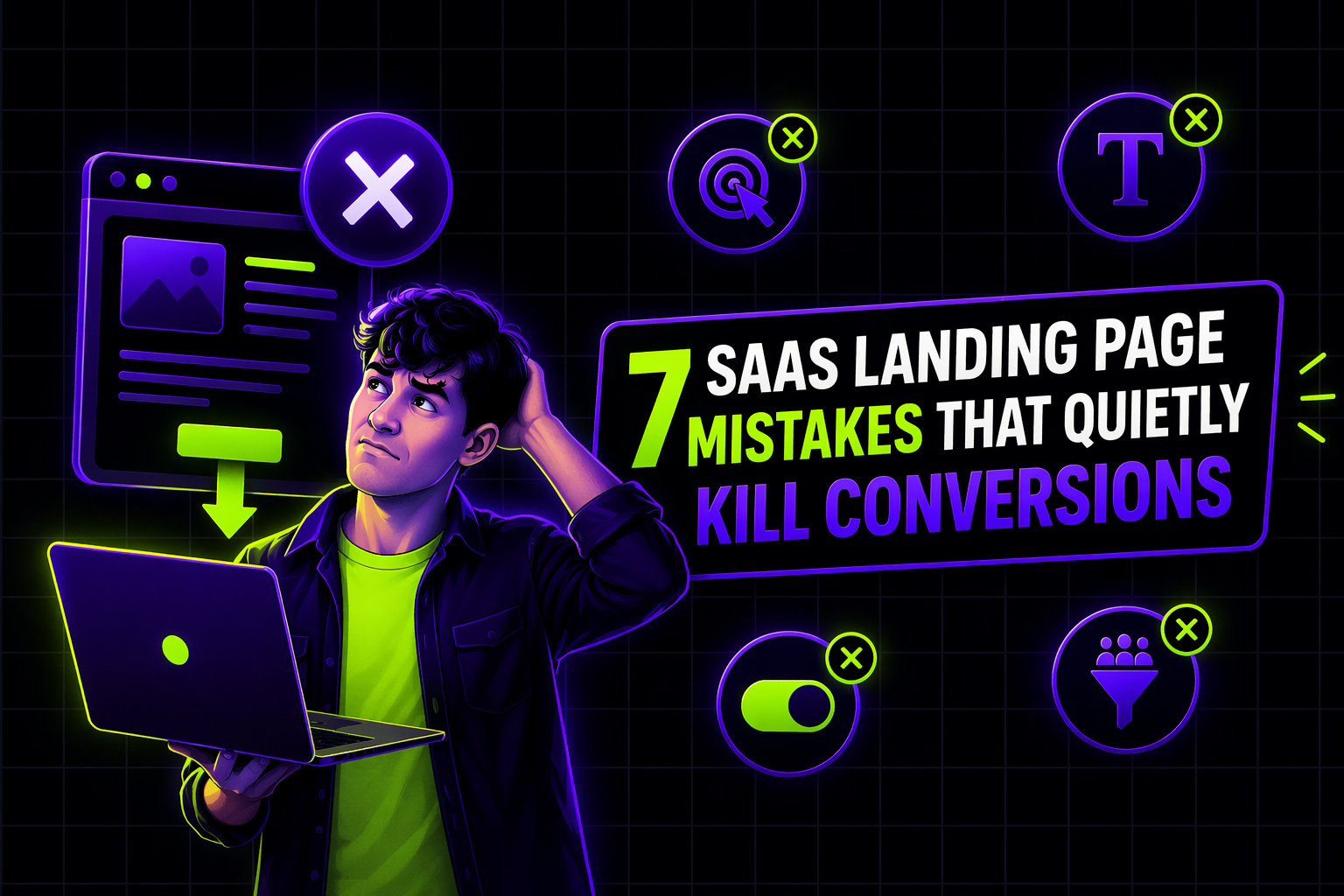
Here are seven landing page mistakes that quietly destroy SaaS conversion rates.

1. Leading With Features Instead of the Problem

Many SaaS landing pages begin by describing the product:

“AI-powered platform for advanced workflow orchestration.”

This is technically accurate, but these pages never tell the visitor what the value is for their individual business or circumstance. 

A visitor doesn’t come to a landing page asking themselves, “What features does this tool or platform have?” 

They ask: 

  • What problem does this solve?
  • Is this relevant to my situation?
  • How is this different from alternatives?

Strong landing pages create a foundation for the conversation in the problem first, not by advertising the product from the get-go. 

Effective pages frame the narrative by identifying and relating with friction that buyers already feel. 

Eg: 

“Marketing teams lose hours every week manually stitching campaign data across tools.”

Once the problem is relatable, the visitor is a lot more open to learning about the product or solution.

2. Weak or Generic Value Propositions

One of the most common SaaS landing page mistakes is a headline that sounds good but communicates little.

Eg: 

  • “The Future of Marketing Intelligence”
  • “Smarter Customer Engagement Platform”
  • “Powering Digital Growth”

These statements are aspirational, but the visitor is left asking “What’s that supposed to mean?”

A landing page headline should help visitors quickly answer three questions:

  1. Who is this for?
  2. What problem does it solve?
  3. Why is it different?

If visitors need to go through multiple sections of your landing page to understand your positioning, that friction is what kills interest. 

Clear positioning reduces cognitive load.

Lower cognitive load increases the likelihood that visitors continue evaluating the page.

3. Poor Information Hierarchy

Many landing pages contain excellent content, but they’re arranged poorly. 

Common issues include:

  • Product screenshots before explaining the context
  • Long feature lists before showing benefits
  • Pricing discussions before establishing value

Landing pages should mirror how SaaS buyers evaluate solutions.

Here’s a common evaluation process. 

  1. Problem recognition
  2. Solution category understanding
  3. Product differentiation
  4. Proof and credibility
  5. Implementation confidence
  6. Call to action

When sections appear out of order, the landing page tells the visitors to reorganize the visitors themselves. That friction is where you find drop-offs.

4. Lack of Trust Signals

Even if the product sounds compelling, buyers hesitate without validation.

Landing pages frequently underestimate how much social proof influences conversion decisions.

Visitors instinctively look for signals such as:

  • Recognizable customer logos
  • Case study highlights
  • Testimonials describing measurable results
  • Industry recognition or awards

Without these signals, any claims made feel like you’re building castles in the sky. 

This is even more relevant in B2B SaaS, where trust signals reduce perceived risk.  The visitor is silently asking the question that every buyer in history would. 

“Has this worked for companies like mine?”

5. Overloading the Page With Features

SaaS products are often complex, so teams are eager to showcase everything they can do. And the result? 

  • Feature grids with 12–20 capabilities
  • Technical descriptions packed into every section
  • Screenshots with little explanation

Conversely, this is what makes the value proposition less clear. Visitors don’t want to know everything the product can do. They’re here to understand why the product matters to them. A high performing landing page will emphasize: 

  • Core outcomes
  • Key differentiators
  • A few representative features

You can give them the laundry list of features once they’re interested, through documentation, product pages, and even demos.

6. Calls-to-Action That Appear Too Early

Another subtle mistake is placing aggressive CTAs too soon. Landing pages often start with:

“Book a Demo”

While demos are important, most visitors arriving from ads or search are still in the evaluation stage.

If a CTA appears before the page establishes:

  • relevance
  • credibility
  • product clarity

visitors will ignore it. 

The best landing pages introduce CTAs progressively. 

  • Early sections build understanding.
  • Middle sections build trust.
  • Later sections invite action.

This method of sequencing ensures the CTA is aligned with how ready the visitor is to click on them.

7. Designing for Aesthetics Instead of Decision Flow

Modern SaaS websites often look beautiful. Animations are smooth. Layouts feel clean. Color systems are refined. But a beautiful website does not guarantee conversion. 

The landing page’s primary purpose isn’t to look good. It’s to guide visitors towards making a confident and educated decision. 

Effective landing pages prioritize:

  • clarity over decoration
  • narrative flow over visual experimentation
  • evaluation support over aesthetic novelty

This is why SaaS companies often conduct structured design reviews or audits before redesigning landing pages. 

For example, when evaluating a landing page, teams often analyze:

  • messaging clarity
  • information hierarchy
  • friction points in the evaluation journey
  • trust signal placement
  • conversion pathway design

At Payan Design Studio, many landing page engagements begin with this type of diagnostic review. Very rarely is the goal to make the page look better. It’s to understand where the evaluation journey breaks, and how we can get the visitor back on track to understanding the product and making a confident decision.

Because once that break is identified, design improvements become far more strategic.

Simple, ongoing design
support for fast-moving
teams.

Ongoing design requests, handled with predictable turnaround. No long-term commitment.

How This AI Brand Got the Upgrade It Deserved →
Interactive Design Preview