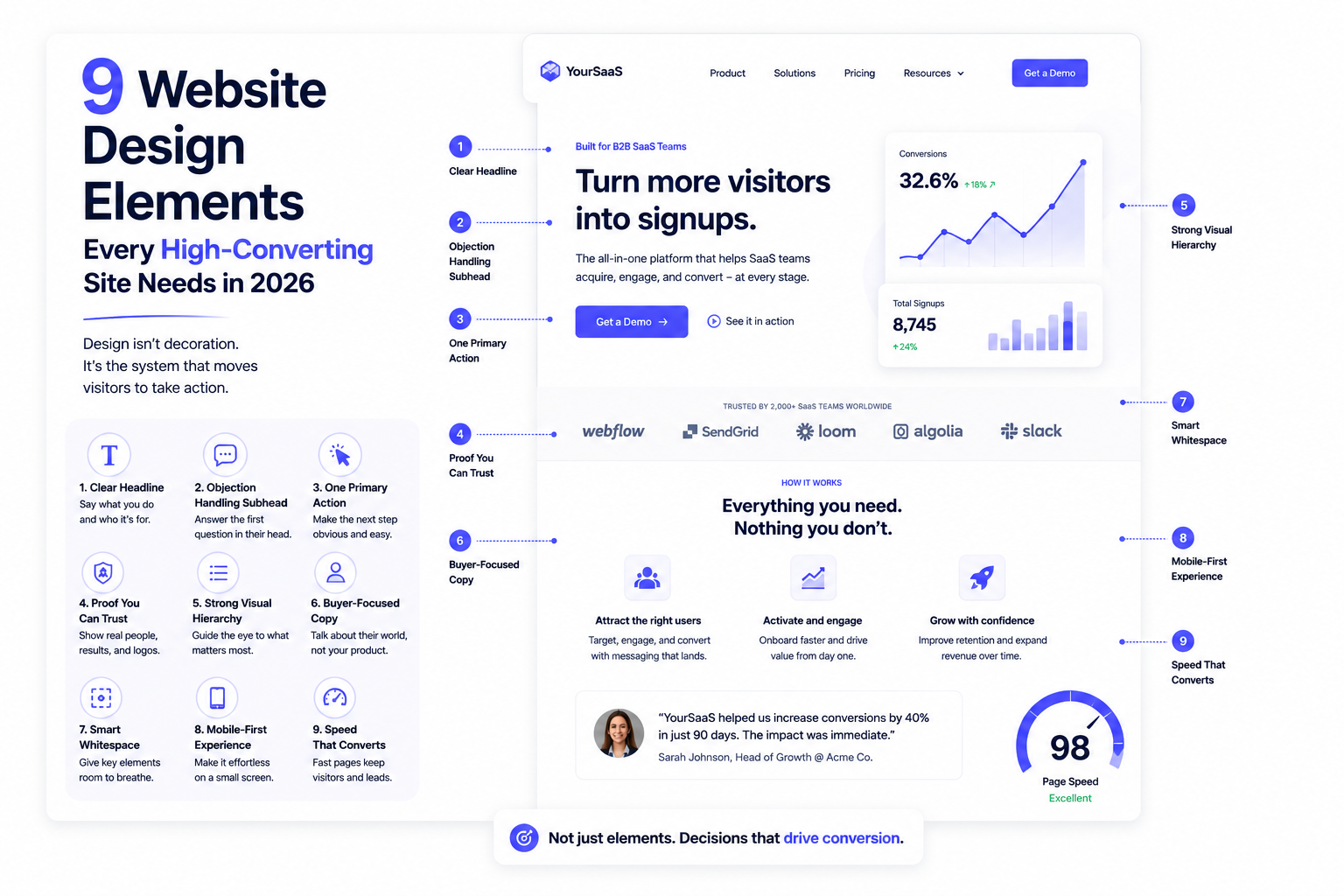
9 Website Design Elements Every High-Converting Site Needs in 2026

Author
9 Website Design Elements Every High-Converting Site Needs in 2026

Introduction

Most websites aren't ugly. That's the strange part. Walk through a dozen SaaS sites and they all look fine — clean type, decent spacing, a nice illustration or two. And a lot of them still don't convert.

The reason is that converting and looking good are different jobs. A page can be visually polished and still fail to do the one thing it exists for: move a specific visitor one step closer to a decision. The elements below aren't a style checklist. They're the parts of a page that actually carry that weight — the ones that decide whether someone who landed curious leaves convinced.

Here's the thing worth saying first. Almost every "design elements" list treats these as boxes to tick. They're not. Each one is a small bet on how your buyer thinks. Get the reasoning behind it and the element does its job. Copy it as a rule and you get a page that has all the right parts and still goes quiet.

So here's what actually carries the weight, and why.
1. A headline that says what you do, not how you feel about it

The hero headline is the highest-leverage element on the entire site, and it's the one most often wasted on a clever line that says nothing. A visitor arrives with one question: is this for me? A headline that answers it in plain words — what you do, who it's for, what changes — outperforms a poetic one every time. The friction it removes is the half-second of confusion that sends people back to the tab they came from.

2. A subhead that handles the first objection

The headline earns attention; the subhead keeps it. Its job isn't to restate the headline in more words. It's to answer the very next thing a skeptical visitor thinks — "okay, but how?" or "for a team like mine?" The best subheads read like they're finishing the visitor's own sentence. That's not decoration. That's a buyer being walked past their first doubt before it hardens.

3. One primary action, made obvious

A high-converting page makes the next step impossible to miss and easy to take. One primary call to action, visually dominant, repeated as the page earns the right to ask again. The mistake isn't an ugly button — it's three competing buttons that all feel equally urgent, which leaves the visitor to do the deciding. Every extra choice you hand someone is a small reason to leave. Clarity here is a conversion lever, not a design preference.

4. Proof a stranger will actually believe

Trust is built fastest by people who aren't you. Logos, a specific testimonial, a real number, a named customer — these do work your own copy can't, because the visitor discounts what you say about yourself and weighs what others say more heavily. The element that matters isn't "social proof" in the abstract. It's proof placed at the exact moment doubt would otherwise creep in: right after a claim, right before the ask.

5. Visual hierarchy that tells the eye where to go

On a converting page, nothing competes for attention by accident. Size, contrast, and spacing are doing a job — pulling the eye to the headline, then the value, then the action, in that order. When everything is bold, nothing is. When everything is equal weight, the visitor has to work to find the point, and working is exactly what they won't do. Good hierarchy isn't about looking calm. It's about deciding what someone sees first, second, third — because that order is the argument.

6. Copy that's about the buyer, not the product

This is design as much as wording, because layout decides which copy gets read. The sections that convert are the ones framed around the visitor's situation — their problem, their outcome — not a feature tour. A page organized around "here's what you get" beats one organized around "here's everything we built." The design choice is what you put first and how much room you give it, and that choice should always favor the buyer's question over the product's resume.

7. Whitespace that lets the important thing breathe

Whitespace is the most underrated conversion element because it doesn't look like anything. But space around a headline or a button is what makes that element feel important. Cram everything together and you flatten the page — every part shouts, so nothing lands. Generous space isn't empty. It's emphasis. It tells the eye what matters by giving it room that the rest of the page doesn't get.

8. A page that holds up on a phone with one thumb

Most of your traffic is on mobile, half-distracted, scrolling with a thumb. An element that works on a wide desktop screen and falls apart on a phone isn't a working element. Tap targets big enough to hit, text big enough to read without zoom, a primary action reachable without a stretch — these aren't accessibility footnotes, they're where a real share of conversions are won or lost. Design for the harder context and the easy one takes care of itself.

9. Speed, because a fast page is a design decision

The best-designed page in the world converts nobody if it loads in eight seconds. Performance gets treated as an engineering concern, but the choices that slow a page — heavy images, a dozen fonts, animation for its own sake — are design choices. Every second of load time is visitors leaving before they see a single thing you made. Fast isn't a feature. It's the precondition for everything else on this list to even get a chance.

Why the list isn't the point

Notice what these nine have in common. Not one of them is really about how the page looks. Each is a decision about how a specific person moves through the page — what they see, what they doubt, what they trust, what they do next. That's the difference between design as decoration and design as a conversion system.

Which is also why the list can mislead. You can add every element here and still build a page that doesn't convert, because the elements aren't the win — the judgment behind them is. Knowing your buyer well enough to write the headline that lands, to place proof where the doubt lives, to decide what the eye sees first: that's the part no checklist gives you.

That's the work we do at Payan — not adding design elements to a page, but making the calls underneath them that decide whether the page actually moves someone. If your site has all the right parts and still isn't converting, that gap is usually where to look.

Simple, ongoing design
support for fast-moving
teams.

Ongoing design requests, handled with predictable turnaround. No long-term commitment.

Interactive Design Preview